Still, there are colors that are most advantageous for you. And their skillful combination with the rest creates the concept of elegance and taste. Dressing monochrome, when all the details of your toilet are the same color, has long been a sign of bad taste.
There are few exceptions to this rule - if you are not a bride or in mourning, then your clothes should contain three shades - the main color, an additional color that harmonizes and shades the main one, and, possibly, a contrasting detail, an intriguing color accent. Selecting and combining them correctly is often a very difficult task.
A lucky few, endowed by nature with a subtle artistic taste and color perception, can choose color scheme wardrobe, relying on your intuition. For everyone else, in order to always be stylishly and tastefully dressed, you need to learn a few rules established by Sir Isaac Newton!
White color - with everyone
Beige color boldly combines with calm tones, and can also be perfectly combined with richer and brighter tones. Beige color is combined with colors: khaki, marsh, cocoa, gray, taupe, chestnut, chocolate, yellow-green, olive, rusty brown, terracotta, eggplant, purple, bright blue.


Pink color- with white and soft blue, with light gray, intermediate between red and white tones.
Red color- with yellow, white, brown, blue and black, lilac and pink, black and silver, black-brown and sand. Red tones are now boldly mixed with each other, and look stunning at the same time. A more moderate option is to combine red with black.


Bordeaux- the color of a woman who knows her worth. Bordeaux goes well with black and dark blue, as well as with colors: green, olive, gray, blue-green, tomato and other shades of red. Berry tones go very well with Bordeaux: blackberry, blueberry, elderberry.


Fuchsia, crimson, purple colors are combined with colors: yellow, orange, dark green, green, bright blue, purple. Raspberry color also harmonizes well with pink and white colors.

Coral color has twelve varieties, these include pink-orange shades and rich red-orange. Combines with colors: white, beige, gold, nude, brown, dark brown, khaki, shades of gray, scarlet, pink-peach, lilac, lilac, hot pink, orange, yellow-orange, pale yellow, dark blue , gray-blue, black.

Yellow– represents the sun, wisdom, fun, self-confidence and freedom. Gold color is the color of fame and wealth. Yellow color goes well with colors: marsh, blue-green, orange, warm brown, chocolate, black, dark blue.
Golden color goes well with colors: olive, brown, red, purple, dark green, violet. Yellow color - with blue, violet, lilac, turquoise. Yellow color without decoration or addition to it is unattractive.
Yellow color combination table


Orange color– a cheerful, bright, summer and positive color, dynamic and ethnic, the color of the brilliance of the setting sun. Bright orange color goes well with bright colors: bright yellow, mustard, beige, purple, brown. Muted orange or terracotta goes well with calm shades - pale yellow, gray-green, khaki, brown, chestnut, chocolate, navy or taupe. To orange and yellow flowers The contrasting black color is very suitable.
Orange color combination table


Brown color- with sky, cream, yellow, green and beige, denim blue, smoky blue, light green and white; the color of May grass and very light green, lilac and faded pink. Brown color goes well with olive, gold, blue-green, orange, lilac, light pink, all shades of beige, ivory and gray. And the unexpected and extremely successful combination of warm brown and turquoise will make an excellent impression.
Rust brown goes with plum and brown; purple with orange and creamy white; light green with camel; red with yellow and creamy white; brown with blackberry.
Brown color combination table


Green color- with brown, orange, light green, yellow and white flowers and only light greens - with gray and black tones. It is intermediate between cold and warm tones.
Green color combination table


Olive color harmonizes with colors: blue-green, warm green, khaki, apple green, herbal, eggplant, burgundy, cherry, purple, dark purple, brown, golden, red, orange.


Mustard goes with colors: brown, chocolate, terracotta, yellow, beige, khaki, blue-green, coral, hot pink.
Blue goes with orange; brown and peach, khaki and faded orange, creamy white, blackberry with splashes of brown, light brown and tomato; greyish-orange and purple.
Mustard color combination table


Night blue combine with pungent pink and pine green; red and white; pale pink with dark brown and silver; May greens with blue-green; gray with bright yellow and pale pink.
Blue color comes in light and dark tones
Light blue - with white, yellow, orange, pink flowers, is intermediate between red and blue.
Dark blue - with light blue (cyan), gray, red,
denim blue, smoky, plum blue; with green and white; gray, light pink and brown; pink and green-blue; vanilla yellow and light blue; dark brown, purple.
Blue color combination table


Blue goes with colors: pink, lilac, coral, light purple, yellow, bright blue, dark blue, gray, white, beige. Turquoise is combined with white, yellow, orange, purple, blue-green.
Combination table blue color


Lilac pink goes well with lavender and dark blue; dark brown with pink-red; brown with light brown; silver with denim blue and yellow, goes well with lavender.
Purple color - with white, yellow, orange, pink colors, is intermediate between red and blue. Light shades of purple are called lilac. They are combined with yellow, orange, gray and white colors.
Towards the color lilac include the colors of violets or dark lilac inflorescences, purple. Lilac is the color of femininity and is associated with sophistication, grace and elegance. The best thing lilac color goes well with dark neutral shades - black, gray or navy blue.
Purple- the color of nobility and luxury. Pairs best with blue. Lilac color and all its various shades are considered one of the sexiest, mysterious, mysterious and sensual colors. Lilac color goes well with colors: pink, white, blue, lilac of a darker or lighter shade, lemon, the color of a withered rose, silver shades, blue, cornflower blue, lilac and violet.
Table of combinations of purple and lilac colors


Grey colour– the color of elegance, intelligent, harmonious, calms contrasting combinations, used in a business dress code. Light grey colour looks good in the finest natural lace or sensual silk, graphite gray in suede, and smoky gray in fine wool.
Gray color is boring, so it is better to combine it with contrasting colors: white, blue, black, burgundy, red. For an elegant outfit can be combined with other shades of gray, lighter or darker, and even beige color. Light gray color is best combined with pastel colors: soft pink, yellow, lilac, blue, purple, coral.
Gray-blue goes well with ocher, white and brown; with brown and beige; with purple and pink; with lobster red, turquoise and white; with silver and blue; with May greens and white.
Gray color combination table


Apricot x goes well with camel and brown; light brown, beige and splashes of pink; gray-blue, blue and ocher; sky blue; green, white and silver; red and white.
Camel is combined with blue-gray and purple; beige-brown, blue and lilac; ocher and brown; yellow, red and white; green and white; lobster red.
Khaki goes with gray-orange and tomato; lobster red and white fur color; blackberry, plum and yellow-gold; golden and blue-green; red, soft green and peach; purple, red and peach.
It's even better if you pair a solid khaki with a printed garment in these vibrant colors.
Khaki color combination table


Black, white and gray are used as finishes.
Black looks good next to orange, yellow, pink, red, lilac and salad tones, with caustic pink, gray, lemon, indigo, gray, lush green with azure, pale green with bright green.
The right combination of colors in clothes will make your look complete and harmonious. General rules They say that this can be achieved by combining:
- sharply contrasting colors, for example, red - blue, red - white, red - cornflower blue, red - green, orange - black, orange - cornflower blue, green - white. Such combinations are used in sportswear, children's and youth clothing;
- contrasting colors, for example, cherry - pink, blue - cornflower blue, lilac - lilac, green - light green. Such combinations are used in various types clothes; semi-tonal colors, for example, soft pink - soft blue, soft light green - soft lilac.
- solid colors, for example, brown - beige, light red - dark red. Such combinations are used in everyday clothing and clothing for overweight women.
All pastel colors are combined with each other, regardless of shade.
Pastel colors are beige, peach, pink, light blue, etc. Those. all colors that add a lot of white. These colors can be combined with each other in any order. Be careful with pink - the only color that is fattening.
Use from 2 to 4 colors. If you use only 1 color, it creates a feeling of dullness and paleness. If you use more than 4 colors in your clothes, then when they see you, people's eyes jump from one color to another, not knowing where to stop, which unconsciously increases anxiety.
You can combine either related or contrasting colors with each other. All other options are inharmonious.
Related- these are colors that differ from each other in shade (red, pink, dark red).
Contrasting- these are colors that are completely opposite (purple - yellow, blue - orange). The only contrasting combination that is risky is green and red.
Lilac color is a very narrow concept, and it does not have a wide variety of shades, as in primary colors. Having a small range of tones, it compensates for the lack of color richness (and that is a very relative concept) with incredible mesmerizing beauty, combining tenderness, coldness, and restraint.
Our task is to find out what colors are combined with lilac in clothes so that its natural beauty is emphasized, so that the color is pleasing to the eye, and the image is stylish and harmonious.
Perhaps, purple colour– one of those from which it is difficult to take your eyes off, it is so attractive and iridescent. Such beauty is understandable - in some way the lilac color reminds us of pink, very feminine, delicate or bright depending on the shade, and at the same time there is something of blue and light blue in it. The most accurate definition of lilac color would probably be "delicious" *wink*
Despite the fact that the shades related to the color lilac (amethyst, eggplant, wisteria, etc.) are quite different from each other, they all require almost the same approach to color ensembles.
And in general, combining colors in clothes with lilac is not so difficult. (To get to know general rules color combinations, read our article:).
Lilac color and light shades
The combination is fresh and very pleasant. White color will make lilac even deeper and richer. In summer, an image made in such shades will resemble southern countries and warm southern evenings, and in winter such a color ensemble will correspond to the winter range with its coldness and some blueness. But it’s better to add some other color to this pair, for example, pink, blue or gray.
Lilac color combines most magically with silver color. This ensemble is probably not suitable for everyday looks(although if the silver color is minimal, then it is acceptable), but for more special occasions.

At such events, the combination of colorful lilac and iridescent silver will put you in the center of attention and give you a reputation as a dude.

Beige is also a good partner for lilac. The combinations with it will be more modest and restrained, but the beige color will make the image more noble and solid, because lilac color is a little frivolous and flirty. To solve the problems of everyday outfits, this duet is an excellent option: not too bright, but also fresh and with a twist.
Lilac color in clothes and pastel shades
Here! This is where the color lilac comes into full bloom! Even the darkest or brightest shades conceal a certain magical power, restrained tenderness and touching coolness, which, in combination with pastel, manifest themselves to the maximum point.

First of all, lilac color in both dark and light versions goes perfectly with soft pink, lilac, soft blue and peach. These colors will “awaken” in lilac its involvement in the pink palette, and you will not find a more romantic, gentle and at the same time ultra-stylish combination.
The combination with light green, lemon, and mint flowers is no worse, where lilac will enhance its coldness.

Another big advantage of such combinations (in addition to the fact that you will get an unapologetically stylish look) is that these combinations can be combined and done in any proportions. This is the advantage pastel colors, which very stylishly “play” with lilac.
Lilac color and other colors
Despite the relative brightness of the lilac color, many other quite bright colors enter into a rather pleasant and harmonious relationship with it.
Lilac+pink+blue
The undisputed leaders are pink and blue, you probably already guessed why. A juicy combination that you can look at forever.

Blue jeans, lilac blouse and pink jacket; lilac jumpsuit and pink T-shirt and blue accessories; lilac trousers, a soft pink shirt and a hot pink jacket are examples of such successful combinations can be cited forever. You can add small silver accents to such ensembles.
Lilac + green
The combination of lilac in clothes with green, especially emerald or jade, looks very unusual and interesting.

But this combination is more suitable for a party or for particularly daring young ladies.
Lilac and wine shades
Lilac in combination with wine shades will please the eye.

A lilac cocktail dress and jacket of this color is an elegant, eclectic and spectacular solution.
Combination of lilac with yellow and orange in clothes

To create light spring and summer looks, yellow and orange colors will be a wonderful pair for lilac, naturally, not their most flashy shades.
Lilac color and black
An ideal combination for the office and everyday life, when lilac is in the minority and is a bright accent against a gloomy background.

Converse combinations are also possible, the main thing is that there are no small black accents or too small clothes (boleros, etc.) on a lilac background; in such a proportion, this contrast does not look stylish.
Lilac color and gray
A good, solid combination. By and large, these colors next to each other do not affect each other in any way, but they still look quite harmonious.

This solution (with the addition of some bright color accents) great for a cocktail dress. The look will also be stylish: gray jeans, a gray T-shirt and a bright lilac cardigan.
The lilac color refreshes the gray palette and gives it its own floral mood!
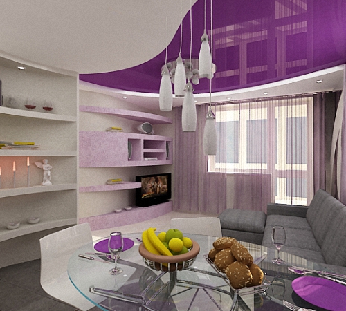
Those who choose lilac color in the living room will have the opportunity to amaze their guests every time. It is very effective and ambiguous - the limitless possibilities of shades of lilac and purple allow you to create interiors of completely different moods. This color is chosen mainly by women, but its positive influence in the living room is felt by completely different people.
Peculiarities of perception of lilac color
The color lilac is not very common in everyday environments, although many people find it attractive and elegant. Colorists claim that it is unique in nature - it is a washed-out shade of pale purple with an admixture of pink or blue. In different proportions it gives several original tones. It is believed to be a derived color from violet.

Violet itself is born at the junction of blue and red. It combines two extremes - the cold blue and warm red parts of the spectrum. Thus, these opposites seem to mutually absorb each other’s energy, soften and neutralize. That is why one can feel the attractive power of the lilac color, its detachment and uniqueness. He is quite gentle and beautiful, but as if “not native”. Lilac shades in the living room give peace and tranquility, so it is recommended for hyperactive people, as well as when work is associated with emotional overload.
Psychologists do not recommend that a girl choose a lilac dress on a first date; this gives the appearance of coldness and detachment. But men wearing a pale lilac shirt always seem more aristocratic and noble. And here is the living room in lilac tones looks attractive, but inhospitable. Rather, this is a shelter for a lonely wanderer or the boudoir of a socialite, not burdened with family worries, than a cozy family nest.

In nature, lilac shades are found in their pure form only in the color of plant petals, hence the name. And although lilac bushes have about 40 various shades, from white to deep purple, it was this plant that gave it such a gentle name. The most common:
- classic lilac;
- soft lilac;
- pale purple;
- soft violet;
- bluish-lilac;
- gray-lilac;
- blurry purple;
- pink-lilac;
- amethyst;
- dusty rose color;
- beige-lilac;
- cyclamen;
- silver-lilac;
- lilac mother of pearl;
- lilac blue.

Living room design in lilac tones is one of the latest trends, especially since it can highlight any character. Depending on the chosen style, the lilac living room looks especially romantic and elegant, impressive and pretentious. Much depends on the choice of shade, but traditionally it is used for styles:
- Art Deco;
- modern;
- futurism;
- contemporary;
- fusion;
- romanticism;
- boho;
- minimalism;
- Provence;
- shabby chic;
- expressionism.
Great examples - living room in lilac tones photo.

In a calm lilac interior it is also easy to concentrate on intellectual or creative work, summing up results or planning important matters. It helps to achieve a state of peace during prayer or meditation. For those whose personal space is very limited, it is advised to decorate the living room in lilac tones - this will help to abstract from external stimuli.
Light shades of lilac can simultaneously solve certain problems:
- visually expand the space;
- give more light;
- improve and update the room;
- create a cozy atmosphere;
- decorate your living room in a completely new way.
Designers know the properties of shades of lilac, so they suggest using this color in the interior when you want something radically new and unexpected. This is true for those who have lost loved ones or experienced an unfavorable period in life, and when they need to completely change the situation, they rely on the color lilac. But he also has negative side- it gives a feeling of emptiness. Perhaps that is why the lilac color is subconsciously chosen by emotionally unbalanced widows or young glamorous people who have not found their purpose in life, as well as unfulfilled creative personalities with great potential. But he is also chosen for his nobility and purity.
Tip: There shouldn’t be a lot of lilac in the house, otherwise it can make you feel despondent. It is better to decorate the bathroom and living room in lilac tones or the hallway and bedroom, and decorate the remaining rooms in warmer colors.
How to create a balanced interior in lilac tones
The lilac color is both warm and cold, so the overall atmosphere of the interior largely depends on the proportion of red, blue, purple or pink shades in it. For example, lavender and amethyst shades contain more red, so they are friendlier and warmer. This is a favorite color in the Provence style, especially in combination with olive and cream - photo.

If your choice is a lilac living room, the interior should be balanced to balance the proportions. The choice of textiles largely depends on this. For example, beautiful curtains rich purple color undoubtedly decorates any living room, but at the same time they add weight. On the other hand, noble upholstery of upholstered furniture in a lilac shade will add a special charm to the living room, especially if there is a lot of blue in its proportion.
Attention: Oversaturation of the design with shades of purple and lilac can negate all efforts to creating a lung and elegant interior. A lot of light shades give the feeling of an empty, uninhabited space, and an excess of dark purple accessories gives a slightly depressing feeling!
The best option is to choose a more welcoming warm shade, such as pinkish or lilac-beige, for the living room or combined dining and guest area. Combination with fresh herbs, cherry or cream, coffee and white furniture and textiles - in the end warm atmosphere and noble design.
For contrast, in small proportions, you can use:
- black;
- eggplant;
- plum;
- bilberry.
To refresh the living room design in lilac tones and give more life, experts recommend using warmer shades on a lilac background:
- crimson;
- burgundy;
- scarlet;
- yellow;
- apricot.
Special attention should be paid to the design of the living room when the main background is very pale and blurry - lilac with gray or blue. These shades are more suitable for bedroom or bathroom design. To create a special hospitable atmosphere, it is important to competently add accessories, lighting and comfortable upholstered furniture.
If we talk about lighting the living room in lilac tones, then this is a very rewarding background for an original lighting design. All types of lighting fixtures can be used here:
- cold neon and halogens will add mystery to the interior;
- warm incandescent lamps and spotlights will add a friendly atmosphere;
- spot LEDs and color LED Strip Light emphasize the special sophistication of modern interior style.
Tip: Listening to the recommendations of experts is always good, but don’t be afraid to experiment, relying on your own taste, preferences, intuition and accessories you already have. Remember that the most original and “masterpiece” interiors are created at the intersection of prohibitions and recommendations! The only thing to be afraid of is outright bad taste, inappropriate items and ridiculous combinations when using lilac in the living room.
Basic recommendations for using lilac color in the living room interior
1. The main rule in using a lilac background in the living room is overall balance. For example, if the walls are very light, with a slight hint of lilac with a blue or gray tint, then the furniture and accessories should be of a richer color, perhaps with a pattern or original details.
2. When choosing a dark or rich color for the walls in a lilac living room, it is important to complement the interior with light shades and textiles. White looks very beautiful on a lavender background or with amethyst walls. leather furniture or blue velor - photo.

3. The choice of a warm or cold shade of lilac dictates the choice of a companion color, for example, when there is a lot of cold spectrum, it is diluted with contrasting details and warm accents.
4. Warm tone lilac color goes well with shades of natural wood, soft pastel tones and neutral colors:
- grey;
- beige;
- pale pink;
- light green;
- khaki and olive.
5. Lilac-blue living room - perfect option For south side home and “hot” apartments, since this tone gives a feeling of cleanliness and coolness. And on the north side it is better to give preference to pink and lilac colors with warm accents.
5. This color visually expands the space, especially when the walls and ceiling are a single light lilac shade. This property is used to visually expand a small living room or one-room apartment, which has to be divided into several functional zones.
6. A living room design in lilac tones is used to create a noble, aristocratic atmosphere, especially in combination with lilac or purple, which personified the attire of nobles. And pale bluish-lilac is a wonderful color for both a palace interior and a glamorous setting for “socialites.”
7. Gray shades of lilac have a special chic and charm, a special touch of nostalgia, so it is used for an eclectic interior, where different styles are mixed together:
- vintage;
- retro;
- neoclassical;
- fusion;
- Art Deco;
- post-modernism;
- grunge

Combinations of lilac color in the interior
1. Lilac color goes well with white, but if it has a bluish tint or gray, then it looks better with crystal white. And a warmer range of lilac colors is better perceived with creamy white and milky ones. The snow-white color looks very elegant against the background of lilac, but it seems to cool the overall atmosphere.
2. Lilac with pink is a traditionally youth theme that helps create a friendly or festive atmosphere. Exquisite furniture combined with pink in the interior of a lilac living room with silver accessories and stasis - this is “classic” glamor for a young lady.
3. Lilac with gray - great choice For married couple with different characters. This noble range is especially combined with smoky oak laminate flooring or marble or granite linoleum. Such an environment gives a desire for reconciliation, and also subconsciously reminds of the strength of family ties.

4. Lilac color with purple and red is a warm and conducive atmosphere for communication, but there should not be a lot of red. Velvety upholstered furniture in any of these shades on a lilac background looks very interesting. But here it is important not to overdo it with excess proportions - red or purple should be no more than 20% in the living room interior, so as not to burden the atmosphere.
5. Lilac with green - classic combination flowers, which came from the Provence style. But in interior design, the most important thing is the choice of shades of both colors, for example, lavender and olive - the traditional ratio. However, it is important to pay attention to their saturation - if one color is thick, then the other should be blurry. However, even if both shades are blurry or faded, this will not deprive the living room interior of its overall chic - photo.

6. Lilac with metallic shades is a good combination, but you should give preference to silver rather than gold or copper shades. However, a lot depends on overall balance. For example, translucent golden curtains will give lilac interior a bit of sophisticated glamour. A lilac living room with translucent silver curtains, gray upholstered furniture and white textiles is one of the most balanced combinations. You can try to create such an interior yourself.
Advice: If you want to create some kind of special interior in lilac tones - contact professional designers so that you can develop several sketches with different color ratios and in different options stylistics. Especially if you want an exclusive, shocking interior.
Pale mauve
Cheat sheet for color combinations
Nice article from three years ago from Izyuminki.com. Of course, there are statements that can be argued with. But in general, for the first acquaintance with color combinations, it’s not bad at all.
Billiard color or wormwood color
This shade in itself is not striking, but if you are noticed, it will be difficult to look away. Billiard is the color of calm, respectability, wisdom and good luck. And what woman doesn’t suit the color of fortune? In addition, with this shade you can create bright, grandiose combinations.
Consider a combination of mugwort and soft pink, Victorian pink, rose, rich red, alizarin, orange, coppery auburn, pale yellow, apricot, thrush egg, light green, gray-blue, light blue, lilac, orange- beige, yellow-brown and chocolate color.
Turquoise green color

Rare, bright and calm at the same time. He inherited versatility turquoise shades and calm is dark turquoise color. The color will fit into any wardrobe. Combinations with this color can be restrained and modestly intelligent. This color may be present in both business style, and casually, for relaxation.
Jewelry made of gold, silver, emeralds will look good next to this color. It is better to choose transparent stones: pink, blue, orange, cold green shades. Wooden decorations will go well with it.
What does turquoise go with? green tint? Combinations are not intrusive, but with character can be obtained with soft pink, coral lilac-pink, pale sand, pink coral, ocher, regatta, emerald, soft blue, dark pink, taupe, lilac, blue-lilac, beige-pinkish, silver, gold, bronze, brown.
Turquoise blue color

This color is traditionally considered turquoise. It is bright, but not blinding. Energetic, sociable, this color suits everyone. The color is changeable in combination, it will give you a special personality.
This color is good for both the beach and the office, and will be comfortable at a party or at home. Don't pass by this color: a universal color with character, it will be ideal in any wardrobe.
Costume jewelry will include gold, silver, pearls, topazes, amber, coral, and turquoise. Any blue shades in stones and jewelry are welcome.
Consider color combinations of turquoise with hot pink, red rose, yellow ocher, pink coral, orange, blue-green, cold light green, aquamarine, purple, blue, blue-white, white, straw beige, silver, gold, bronze, brown .
Pale turquoise color

This color is similar to aquamarine. Delicate, gentle, flowing color of transparent sea water. It cannot be called pale or bright. It will suit any color type.
This color, in its calm bliss, is best worn on vacation and summer celebrations. The relaxation that this color promotes will be superfluous in the bustle of everyday life. Jewelry that will suit a dress or blouse of this shade of turquoise: pink-orange coral, shells, pearls, gold and silver. Pale carnation-colored jewelry, yellow and orange shades of stones or jewelry will suit it. It is advisable to use opaque stones.
Pale turquoise color combination: with peach pink, carmine, golden yellow, pink coral, orange coral, color sea wave, cold shade of green, sky blue, burgundy, lavender, aquamarine, beige, silver, gold, bronze, brown.
Pale lilac color

Fresh, delicate violet color, it creates a truly spring, sunny mood. This shade will refresh your facial skin, soften your features, and highlight your hair color.
Pale lilac will look good on both spring and summer outerwear and underwear. Dresses, suits, sweaters of this shade should be worn on vacation and holidays. In the office, pale lilac will distract from a serious attitude towards specific activities.
Pale lilac is combined with colors such as pink, red magenta, purple, yellow-beige, green-yellow, apricot, carrot, mint, green peas, sky blue, violet blue, amethyst shades, golden beige, yellow - brown shades.
Grape-gothic color or dark grape color

This is a mysterious, evening, purple shade. What's hiding behind the dark veil? Passion, hidden desires, the dark side of the “I”... Unlike black, gothic grape is a more emotional color. It has more personality and character than other shades.
Combine dark grape with pink, magenta, fuchsia, red-orange, dark red, apricot, yellow-green, pale yellow, light green, bright emerald, gray-blue, blue, lilac, neutral beige, yellow - beige, light brown, brown colors.
Glycine color or gray-lilac shade

If lilac is a bright, rich shade, then glycine shimmers discreetly. He has not lost the tenderness and romance of lilac, but has acquired the calmness, stability and wisdom of gray. This shade will speak of the owner’s constancy, sensuality and maturity of character. Not recommended for representatives of the “winter” color type.
Combine a gray-lilac shade with pale pink, baby pink, strawberry red, dark red, saffron, pale yellow, light yellow, gold, thrush egg color, marsh green, dark gray-blue, denim, blue, beige , gray-brown, dark brown shades.
Lavender color

Rich lilac shade. Shrill and calm at the same time. Only a contrasting appearance can withstand its onslaught. The boldness of the lavender shade emphasizes self-confidence, although it is still not suitable for the office. Bright and “detached from reality”, he does not contribute to a working mood. But if you decide to conquer with your mystery, then this color is perfect for this.
Lavender color prefers contrasting combinations. Such as pearl pink, fuchsia, yellow ocher, pale yellow, light orange, poisonous green, light green, menthol, blue violet, sky blue, grape, dark violet, beige, brown and dark brown .
Blue-lilac color

A calm, balanced shade of lilac. It can be called everyday. Unlike all other shades of lilac, it will not cause a strong resonance in everyday, office duties. But his main element is holidays, travel, relaxation.
Like lavender, blue-lilac will inspire self-confidence, but not due to its brightness, but due to the stability of the predominant blue hue.
Colors combined with blue-lilac include soft pink, strawberry, yellow, apricot, light orange, wormwood, malachite, menthol, indigo, soft blue, amethyst, gray-violet, yellow-beige, yellow-brown, brown
Lilac amethyst or lilac pink color

Sexy, seductive, complex. This is a more delicate and lighter relative of the red-violet hue. It has more enthusiasm than languor. Amethyst color is more dynamic compared to other shades of lilac, so you can see sportswear in such shades; more muted tones of amethyst will fit into a casual style.
Like all shades of lilac, lilac-amethyst is not well suited for office work, but it fits into everyday life more than others.
Consider such combinations of lilac amethyst as with the color of honeysuckle, red magenta, greenish yellow, golden, light orange, menthol, mint, light green, cobalt, electric blue, dark lilac, lilac, peach beige, light brown, yellow-brown.
Purple colour

Classic lilac, medium intensity shade. Bright personality, romance, femininity. It is ideal for representatives of the “spring” and “winter” color types.
This shade amazes the imagination with its integrity, sophistication, and, oddly enough, rarity. In addition to femininity, there is something otherworldly hidden in this shade: a mystery associated with another world. Therefore, the lilac color can attract natures prone to metaphysics, and repel practical people.
Lilac color is combined with pink, bright red, pale yellow, ocher, pale carrot, menthol, emerald, pale green, aqua, denim, red-violet, violet-purple, beige-apricot, light yellow- brown, red-brown
Dark turquoise color

This color is similar to sea green. This is the least bright turquoise, it will also suit everyone, but representatives of the “summer” color type should especially take a closer look at it. Unobtrusive, careful, soft color serves you invisibly. Without focusing attention on itself, the color, first of all, presents you, highlighting your skin favorably, giving your eyes a blue-green shine or creating a contrast with brown eyes.
Dark turquoise is as versatile as turquoise blue. For jewelry, transparent stones of any blue, lilac, pink shades are suitable; pearls, amber, agate, garnet, turquoise. Feel free to combine gold and silver with this color.
What color goes with this shade of turquoise? Soft, discreet. You may like combinations of turquoise with coral, lilac pink, raspberry coral, green yellow, light sand, orange sorbet, blue-violet, lilac, light lavender, burgundy, lavender, thrush egg color, cream, light beige, silver, gold, bronze, brown.
Topaz blue color

It is also considered turquoise. This is a more sporty option; T-shirts often come in this color. But look, the dresses look great too. This bright shade is gentle in its own way and is more suitable for relaxation, holidays, and sports than for the office.
It will look great with red coral, gold, silver, pearls, turquoise, topazes, diamonds and amethysts, lilac, yellow, orange and pink stones.
What goes with turquoise? Certain, rich colors such as soft pink, dark red, pale yellow, rose coral, orange, teal, violet blue, regatta blue, pale turquoise, dark lilac, lavender, gray, silver , gold, beige-brown, brown.
Atlantis color or turquoise green color

Self-confidence, independence, personal responsibility, creativity- qualities that the color “Atlantis” expresses. In this color you will feel free from the “impossible”, and your partners will see limitless potential in you.
The Atlantis color is universal and suitable for all color types.
Turquoise green color is combined with red, red rose, saffron, yellow-orange, gold, golden, aquamarine, malachite, cobalt, royal blue, blue, glycine, lilac, light pink-beige, brown, dark brown
Baltic or grey-blue color

This is dedication to an idea, perseverance in achieving it, intellectuality, the ability to discard everything unnecessary. This shade is pleasant, it does not distract attention, but makes you relax and make more rational decisions.
The Baltic color will look good on representatives of the “spring”, “summer” and “autumn” color types. This shade will be appropriate both in the office and on vacation.
Gray-blue color is combined with white-pink, lilac, dark lilac, red rose, peach, sand, ocher, emerald, azure green, blue, cobalt, electric blue, white-blue, glycine, beige-peach , gray-brown and dark brown.
Spring green color

This is a light shade of blue-green - one of the few universal colors that is perfect for representatives of all color types. You are probably surprised by this name, because spring greens usually look light green in color. But this color fits perfectly into the spirit of the spring mood. This is a very energetic color that can awaken you from winter dullness and apathy.
This shade of blue-green goes well with pronounced colors. Such as: geranium, pink, iris, red, dark red, orange, orange sorbet, sand, light yellow, gold, viola, blueberry, light lilac, lilac, bright purple, brown, dark brown.
Viola color

Viola is the color blue. It will suit all color types. The color is expressive, catchy, but does not tire the eye. In addition, it is very feminine and elegant.
After a long winter, viola is one of the first flowers to bloom in the sun, but what if it’s not flowers that make spring so elegant? Blue color holiday and everyday life, it makes everyday life easier and weekends more eventful.
This color will be paired with ringing colors. Such as: magenta, purple, dark pink, red, dark red, orange, orange sorbet, light yellow, gold, light sand, spring green, neon green, azure, blueberry, lilac, dark purple, brown , dark brown.
blueberry color

Dark blue color. Cold, rich, it requires bright makeup. This is more of an evening color, and in combination with flowing fabrics it is designed to conquer in the unclear flickering of lights.
It is suitable for representatives of the “summer”, “autumn” and “winter” color types. But keep in mind that this bright color makes the skin look pale. It slims your figure and enhances the contrast between your face and hair.
Dark blue color is combined with soft pink, amaranth, cherry, orange, yellow-orange, light sunny yellow, sand, blue-green, spring greens, aquamarine, viola, blue, light pale lilac, dark lilac, brown, dark brown, black-brown colors.
Bright turquoise color

Just like coral shades, turquoise has bold tones. But for a bright life you need bright colors. The bright turquoise color is amazingly rare and beautiful colour. He attracts the eye and carries him along. A tropical diva, a bird of paradise - this is the definition of the image that this color creates.
But not everyone can afford it. For this color, the appearance should have the highest contrast. Representatives of the “winter” and “spring” color types can afford it, provided they wear bright makeup.
Jewelry for clothes of bright turquoise color should be selected from transparent stones any blue or green shade. Avoid pale jewelry. Gold and silver, pearls, coral and turquoise will also suit you.
What color goes with turquoise? Just as bright and sonorous. Take a closer look at such combinations as pink, yellow, yellow-green, pink-coral, neon green, dark blue, electric blue, aquamarine, dark pink, purple, regatta, cream, gray, silver, gold, beige brown, old bronze.
Bright lilac color

Lilacs like coral or turquoise can be very vibrant. In this case, all the properties of the shade are enhanced.
Bright lilac color is an indicator in determining the “spring” color type, since the appearance of the “summer” color type will be pretty spoiled by it. If you are a “spring” or “winter” and want to stand out significantly from the crowd, then a bright lilac shade will give you increased attention.
Combine bright lilac with pink, bright red, sunny yellow, apricot, bright orange, turquoise green, bright green, charteuse, viola blue, azure blue, bright purple, pale lilac, light beige , light brown, brown.
Persimmon color

A shade of orange, such a brightness that will not spoil representatives of the “summer” color type. A decrease in brightness brings into this color the tenderness of love romance, which will stand next to the courage of a teenager and the ease of a child. The color of persimmon will make your image dynamic and sociable. Adventure will always be near you.
This shade of orange goes well with light pink, magenta, burgundy, red, tan, yellow, ochre, emerald green, billiard green, neon green, blue, electric blue, light azure, orange beige, mocha and chocolate. color.
Coral red terracotta

Rich spicy color. And soft and bright at the same time. The reddish-terracotta color reeks of the east, its leisurely pace, stormy colors, and sunset. This color can bring peace and tranquility and... a thirst for adventure. The color is suitable for an evening dress, swimsuit, leisure wear or business suit.
Decoration can be coral, gold, silver, emerald, garnet, diamonds or alexandrite.
This coral shade is combined with pale yellow, magenta, dark red, scarlet, mustard, thrush egg color, azure, sky blue, blue-green, Prussian blue, dark gray, silver, gold, white, light gray, brown, black-brown.
Iris color

Pink-lilac shade. Cold, rich, moderately bright. It is suitable for representatives of the “summer” and “winter” color types. You can choose bright accessories and shoes to match this color. This color is piercing and exotic. During the day it pleases with its strength, and in the evening twilight it becomes mysterious. Iris is the color “from the ship to the ball”; if you want to get to the club after work, bypassing the house, then this color is perfect for you.
It goes well with colors such as soft pink, fuchsia, dark pink, red, rose color, orange, orange sorbet, pale yellow, gold, light sand, olive, light green, blue, blueberry, lilac, purple, brown and dark brown.
Bright coral pink orange

Or a shade of scarlet, which is distinguished from the classic by coolness. IN northern regions In Russia this color is not found in the natural environment. It’s exotic, but it looks expensive and inspiring. This color should be combined very carefully. Make this the main color or use it in bright accessories, such as a belt, beads, etc. Do not use in a 1:1 ratio with other bright colors. Dilute it with soft and neutral shades.
Consider combinations with coral, bright pink-orange, yellow-green, lilac, yellow-lilac, tomato, sand, green, azure, sky blue, black sea, dark blue, silver, gold, white-beige, nude -white, gray, brown, dark brown.
Coral red-orange

A warm red shade, not as bright as the classic one, but no less rich. It will not hurt the eyes and is suitable for all types of appearance. When expanding your wardrobe, feel free to add coral red, because Lady in red is an image of a beautiful lady that is quite suitable for it. You can wear it anywhere and anytime: a color for both summer and cold weather; for relaxation, for holidays and for work.
A good combination of coral red-orange with light yellow, pink-orange, hot pink, bright pink-orange, dark burgundy, muted yellow-orange, spring green, Prussian blue, gray, lilac, gold, silver, white, sandy light beige, dark gray, brown, dark brown.
Coral lilac pink

An intricate pink shade that is difficult to identify. Ideal for a cold, non-contrasting appearance. If the “summer” color type manages to get this color into their wardrobe, then it will be a pearl, among other not bright, wonderful colors. Silver, coral, pearls, moonstone, amethyst, topaz, diamonds or alexandrite go well with lilac-pink.
Colors that go with coral lilac-pink: champagne color, soft pink, hot pink, raspberry, burgundy, muted yellow-orange, aquamarine, Prussian blue, dark gray, lilac, gold, silver, white-beige, sand - beige, light gray, brown, dark brown.
Coral Raspberry

Coral raspberry differs from raspberry in less pinkness. This color is closer to red: intense, expressive, it is still cooler than classic red. Coral-raspberry is perfect for both the office and the holidays. This color is also acceptable in autumn-winter, as it is combined mainly with dark colors. For cool looks that can't afford bright red, this color is a godsend. Know about it and use it with pleasure.
Combine coral-raspberry with sand, lilac, gray-lilac, red, cherry, spring green, wormwood, Prussian blue, dark gray, rich lilac, silver, beige-pink, beige-yellow, straw, medium gray, brown sepia, dark dark grey.
Coral neon pink

Bright summer butterfly. Not everyone can afford this cool shade. Neon pink will crush the soft features of your appearance; everyone will see a bright spot, not you. But if you try to match your face with a color that is more similar to you, you will get rid of this annoying circumstance. Pearls, turquoise, silver, gold, coral, amber will suit this color.
Take note of the combination of coral neon pink with light yellow, delicate warm pink, cold pink, red, saffron, menthol green, azure, denim, sky blue, dark blue, silver, gold, white-beige, gray, light beige, brown, dark brown.
Coral pink-orange

The border between pink and orange has been crossed, but remains somewhere close. The color is bright enough for “winter” and subdued enough for “summer”. Warm enough for “spring”, “autumn” and neutral for “summer”. This color can be called universal. It is soft and spicy, like the aromas of the east. The gentle sunset color of the sky on a warm day just before dusk. Accessories for this color can be turquoise, coral, amber, amethyst, gold, silver.
The combination with coral pink-orange can be built both on contrast and in similarity. Warm shades will give a feeling summer heat, cold - proximity to the sea, summer rain. Try to match it with amber, delicate warm pink, cool shade of pink, dark pink, golden-copper, muted yellow-green, azure, denim, sky blue, royal blue, silver, gold, white-beige, gray-white, light beige, brown, dark brown.
Coral pink-peach

Complex, soft, caring color. It seems to be both warm and seemingly cold. Shiny items embroidered with sequins and beads go perfectly with it. The color is festive, but not intrusive. You won’t want to be nervous in this color, because it itself personifies relaxation. If you want to be considered happy and peaceful (when you pretend, you begin to believe, and faith works wonders), then this color is for you.
What color goes with coral pink peach? Just as soft and cozy. Sand, carrot, coral pink-orange, soft sunny, muted raspberry, olive, azure, denim, hyacinth, royal blue, gray, silver, gold, white-beige, beige, brown, dark brown.
Coral light pink

In this range it is a cool shade. I would call it sonorous. It is quite bright, but discreet. This color straddles the line between orange and pink. The image that light pink coral creates is one of sensuality and inaccessibility, due to its coolness and sophistication. Light pink coral clothing can be casual or festive. Combine it with gold, silver, pearl, turquoise, and topaz accessories.
Combine light pink coral with honey, red rose, sand, alizarin, grey-pink, olive, azure, denim, blue-gray, royal blue, silver, gold, white-beige, beige, sepia, brown-red, with milk chocolate color.
Coral hot pink

This color is so bright that it practically glows in the dark. Be careful with him, he can easily outshine you (except in winter). But in skillful hands, any selection is successful. If you look at the top left picture, you can see black sunglasses on a girl with a low-contrast appearance. They compensate for the lack of brightness. You can also use bright headbands and headbands.
Combine this shade of coral with colors that are as vibrant as it is. For example, with amber yellow, magenta, dark red, red-orange, azure, aquamarine, blue-green, Prussian blue, dark gray, silver, gold, white, gray beige, yellow beige, light gray, brown sepia, black-brown.
Hot lips color

Or the color of a red rose. It's no longer bright red, but it's not fuchsia either. Decisiveness and balanced decisions, reaction speed and ability to assimilate great amount information in a short time. It's all a shade of red rose.
But be careful with this shade when wearing it to a business meeting. If your partners are pretty exhausted, the shade will irritate them rather than inspire confidence.
The color “hot lips” is suitable for representatives of all color types.
Combine the color of a red rose with a pink-beige tint, light magenta, coral, red-orange, pale yellow, American wormwood, emerald, white-green, cobalt, gray-blue, anthracite, red-violet, glycine, brown-beige , cream, taupe and brown.
Geranium color

Or a shade of coral. This is also one of my favorite colors, but, unfortunately, only representatives of the “spring” color type can wear it with absolute confidence.
In the picture, look at how the model’s skin color pales next to the geranium-colored dress. You can improve the situation by intense tanning or combining geraniums with flowers that suit you.
Coral color is combined with pink, red, dark red, sorbet orange, yellow-orange, soft sunny yellow and sand color, as well as gold, marsh color, olive, thrush egg color, azure, denim, lilac, dark lilac, brown, dark brown, gray-brown colors.
Poppy color

Or orange-pink color. Its exoticism is in its pallor. This shade is close to your favorite of all times peach blossom, perhaps this explains its extreme popularity. In addition, it plays amazingly on tanned skin, but on pale skin it may seem unattractive.
Orange-pink is suitable for representatives of the “spring”, “summer”, “autumn” color types.
And it will be combined mainly with dim, complex colors. Such as: lavender, red, alizarin, peach, brick, gold, light sand, beige, polka dot, wormwood, thrush egg color, gray-green-blue, denim, lilac, dark lilac, brown, dark brown .
Which shade of red is right for you:
Gingerbread color or yellow-brown color

These are hard work, respectability, intelligence, intuition, sensitivity to changes in mood in the team. Such leaders are worth their weight in gold. The color is perfect for business meetings and negotiations. It creates an aura of understanding and a willingness to make concessions, although most often the other side has to give in.
This shade is suitable for all color types.
Colors that go with yellow-brown include grape, red, dark red, saffron, carrot, red, light yellow, pale gold, wormwood, bottle, light green, dark blue, gray-blue, gray-beige, yellow-beige, brown, dark brown.
Cherry coffee color or deep burgundy color

Rich, bold, proud. It gives your appearance a royal touch of arrogance and makes you treat you with complete seriousness. Burgundy is a universal shade. It will suit all color types. Plus, this color is slimming.
The color of cherry coffee has an inner strength. Although it looks discreet, its origin from the color red is evident, which means that it has a tonic effect.
Burgundy color is combined with beige-pink, lilac, rose or “hot lips”, red, white-yellow, gold, American wormwood, Atlantis, fainting frog, Baltic, cobalt, red-violet, glycine, light beige, dark brown, black.
Fondant color or mocha color
Expensive brown tint. Although it itself is quite subdued, you can create bright combinations with it.
Brown, like green, is the color of maturity and stability. Coupled with expensive material and accessories, your importance and attractiveness to others will increase.
This shade is suitable for everyone except representatives of the “winter” color type.
Mocha color is combined with pale pink, beige pink, strawberry, saffron, dark red, light yellow, ocher, billiard, polka dot, blue, sea blue, dark blue, glycine, light pink-beige, brown beige, brown and dark brown.
American wormwood or sand color

The shade is very close to not bright gold, and this means restraint, respectability, intelligence, constancy.
The color of American wormwood will be very useful in a business suit: it does not distract attention and gives the interlocutor the opportunity to fully concentrate on the questions. A light, soft shade creates a positive opinion of you in the eyes of your partner.
This shade is suitable for representatives of the “spring” and “summer” color types.
Consider combinations with sand colors such as pale pink, jelly, cherry, lingonberry, red, burgundy, gold, yellow-green, pale yellow, emerald, pale green, Baltic, cobalt, glycine, light beige, yellow brown, brown.
American Mountain color or pink-beige shade

It is close to the shade of a natural body. It excites the imagination. If you want to attract the attention of men, this shade will come in handy.
Representatives of the “autumn” color type should avoid the American Mountain color, as it will make their face look unhealthy red. You should not choose things of this color and the “winter” color type. This shade is too pale for them.
Pink-beige color looks best on tanned skin.
Pink-beige is combined with such shades as pale pink, lilac, dark lilac, jelly, red, pale orange, ocher, swamp green, wormwood, gray-blue, cobalt, gray-blue, neutral beige , coffee with milk color, light beige, gray-brown and dark brown colors.
Early wheat or winter yellow color

A delicate yellow shade that is neither cold nor warm. Filled with femininity and charm. Due to its central position and light tone it will suit representatives of all color types. With it you can create exotic combinations, both bright and soft. It will look great in the office and at a banquet. Its main gift will be joy and tenderness, which will quietly creep into the hearts of those contemplating it, and, naturally, this areola will fall on its owner.
The color “early wheat”, or winter yellow, is combined with Victorian pink, pearl pink, fawn, strawberry, salmon, sand, bamboo, pale green in cold and warm shades, malachite, denim blue in dark and light shades, lilac, flesh , gray-brown and yellow-brown.
Coral pearl pink color

Pale, delicate shade. It will look good on both white and tanned skin. Pairs perfectly with jewelry made from pearls, moonstone, mother-of-pearl shells, and turquoise. Your image in this color will be mysterious and weightless. The color is good for both midday and summer night.
Combine this coral color with the same not bright shades. Such as white-yellow, coral pink-peach, dark purple, aquamarine, azure, sky, denim, hyacinth, lilac, pale lilac, blue-gray, white, beige, gold, nude, brown, dark brown.
Coral pale peach

This warm shade looks good on golden skin. And if you have a cool skin tone, then you can discover this color with a good southern tan. And if neither a solarium nor the beach shines for you on harsh summer days, then self-tanning can help (it will give a golden tint, which is difficult to achieve in the usual way). This color is good for both office and leisure. Enjoy this warm piece of summer.
You might like the combination of coral pale peach color with yellow-gold, carrot, alizarin, rust, burgundy, olive, azure, blue-gray, denim, hyacinth, lilac, white, gray, gold, warm light beige, pink brown, dark brown
Pale yellow color

Another universal color. This sunny color is considered cold, probably because it resembles a winter dawn. But it is also the color of spring chickens. Pale yellow is a naive, innocent, joyful color. Unlike yellow, it does not oppress others. It is not flashy, but fresh, light, radiant. I want to look at him and look at him. Pale yellow is perfect for summer dresses and sundresses, swimsuits and pareos.
Pale yellow combines mainly with restrained colors. Such as: poppy, geranium, honeysuckle, red, dark red, pale orange, orange sorbet, sand, gold, light green, pale green, neon green, turquoise, denim, lilac, gray-lilac, brown, dark brown.
Finally, we would like to note that a white-toothed smile goes well with absolutely all colors in clothing and their combinations.